Remember the podcast where Joseph D’Agnese and I discussed that hilarious video from Random House where they talked about all the great services they provide to their authors? One of those services, of course, is superb cover art. And while Random House does do some great covers, you would think for their major authors they would keep up a level of quality when it comes to those covers and make sure every one is a winner. Take Lee Child, for instance. They've branded him two different ways since he signed with them years ago (he'd originally been published by Penguin imprints in the US). Here are two of the first kind:


Here are two of the more recent kind:


I don't know about you, but I much prefer the more recent kind, though those still come across as rather bland. But that's usually what happens to the major blockbuster books -- the covers come off as bland, as the publisher tries to make the author's name and title as large as possible. But that's beside the point right now, and a blog post for another time. For now, I want to point out some of the recent paperback covers Random House has produced for the books of the previous branding (you know, the bull's-eye ones).


Personally, I think the rebranding with the paperbacks is great. They still manage to make the author name and titles as big as possible, but still manage to pull off some great images. Was it the same art director working on all three different brandings? Who knows. The point is, Random House is capable of doing some pretty great covers. I even like the one they did for Child's short story ebook that came out last year, Second Son, which maintains the recent branding:

Now, you'd think that they would stay with that design, right? They'd been doing it for the past several books, and even the upcoming release A Wanted Man has the same design.

Well, I'm sorry to inform you that doesn't seem to be the case. I saw the new cover for Child's next short story ebook tonight, and I was flabbergasted. Seriously. I gasted all over my flabber. Take a look.
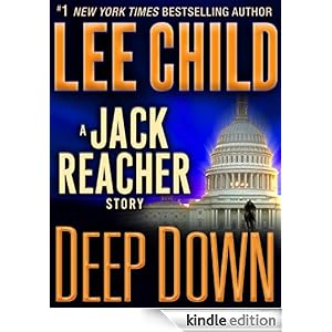
I guess it maintains the same branding, but just in a very ugly way. But maybe Random House knows something we don't know. After all, they do care and take a lot of time to work with their authors to get the books right and ... oh, whatever. I can't even jokingly believe that bullshit either.
The thing is, I like Lee Child a lot. I like the Jack Reacher books a lot. But a cover like the one Random House did for Deep Down? Reacher deserves a hell of a lot more. What's more, so does the author.